AI bot ProDigi
ProDigi
Online
Hello, my name is ProDigi – you tell me the goal, I'll find the best way to get there! How can I help you?
17.07.2026 15:38 o'clock

An atlas that reveals its own assumptions

Visualising Conflict/Peace is an atlas that brings together and contrasts different perspectives on conflict and cooperation in Eastern Europe. The project is led by the VisLab at the Leibniz Institute for Regional Geography (IfL) in Leipzig. It is being developed as part of the KonKoop research network and brings together researchers, cartographers, artists, and field experts.

PROGRESSIVE digital handled the web development and UX/UI consulting for the project. The collaboration with the VisLab team was close and iterative. In early 2026, the atlas went live with nine published case studies. It is designed as a research infrastructure that grows alongside the network.
The Atlas differs from traditional academic publication platforms due to a fundamental decision. Maps and visualizations are not presented here as definitive truths about a conflict. They are artifacts, each with its own history, assumptions, and perspectives. This decision had implications for nearly every aspect of the platform: the content model, editor integration, and the user experience.

Contrib-Module Icon

110+

Contrib Modules

Custom Module Icon

6

Custom Modules

Textdokument

9

Launch Case Studies

Filter Icon

3

Taxonomic Dimensions

Why an existing format wouldn't have been enough

Work on the atlas began with an observation: Peace and conflict studies lacked a publication format capable of presenting complex geographic narratives without oversimplifying them. Three requirements shaped the project from the outset:

Layer Icon

Reflexivity

Each case study features a visualization. However, the aim is also to reveal what lies behind it: data sources, decisions, uncertainties, and perspectives. This is part of the flow of the text, not an appended section on methodology.

Raster Icon

Formal Range

The case studies combine a wide variety of formats: static and interactive maps, 3D terrain visualizations, scrollytelling sequences, photos, and essay-style texts. Sometimes all of these are included in a single post—without individual development for each case.

Wachstum Icon

Growth

The Atlas is not a finished publication. It is an infrastructure that the editorial team maintains, expands, and revises independently.

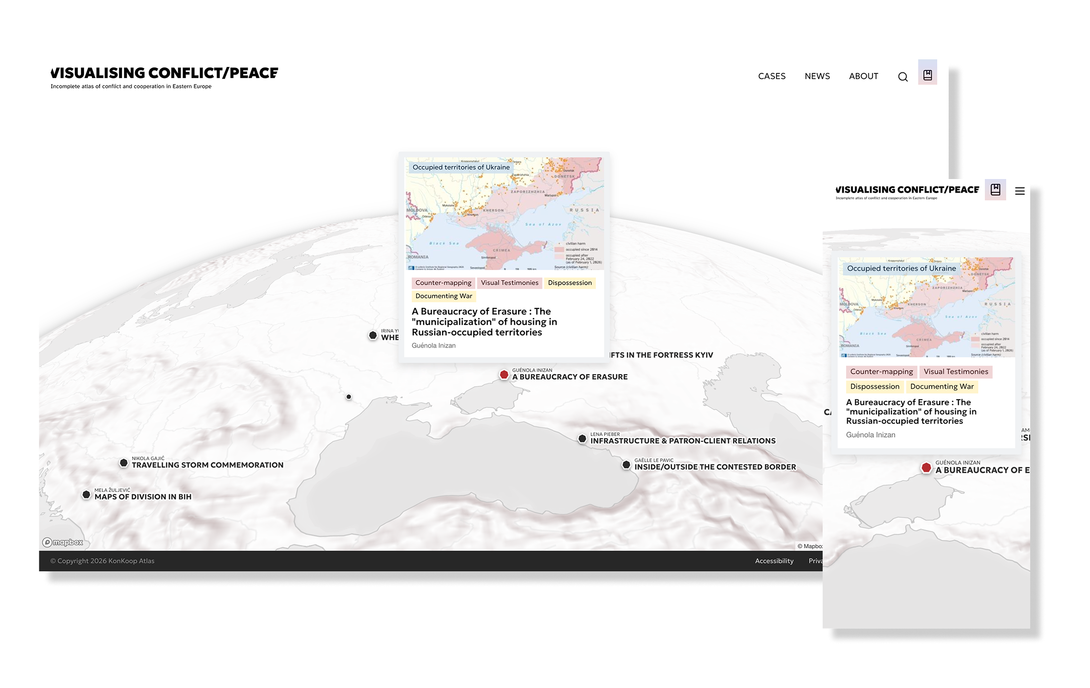
Interactive maps that accompany the text

Maps are at the heart of every case. Not as illustrations—but as elements of the argument. To achieve this, PROGRESSIVE digitally implemented two technologies based on Drupal 11:

Icon Compass

Leaflet + Geofield

Classic interactive 2D maps. Editors enter geodata directly in the backend—coordinates, GeoJSON layers, thematic markers. The maps are rendered in the browser and can be embedded in any article. No development work required per post.

Layer Icon

Mapbox GL JS

Three-dimensional representations for topographic visualizations, terrain models, and spatial relationships that cannot be effectively conveyed in 2D. Particularly useful for cases involving physical geography, visibility analyses, or transboundary landscapes.

Scrollytelling as a Form of Insight

Some cases cannot be told in a static way. They describe a process: a development over time, a shift in perspective, or the gradual emergence of a layer of data. A scrollytelling system was developed for such cases.

Technische Details

How It Works

As you scroll through the text, the accompanying map or graphic responds to the current section. It zooms in on an area, switches between layers, shows or hides data layers, and moves the map view. What the text describes is simultaneously made visible by the visualization. Both run in sync.
The sequences are also accessible and can be followed through text alone. Readers using a mouse or JavaScript will follow the same narrative flow—the sequence of arguments, the development of the perspective. Only the way it’s presented is different.

Entwicklung und Integration

Technical Implementation

This was implemented using modular scrollytelling components based on Scrollama and GSAP:

  • Reusable Drupal components for various types of scrollytelling
  • Configurable by the editorial team without developer intervention
  • Performance-optimized for smooth animations, even with complex maps
  • Accessibility-first: Works fully even without JavaScript

The Reflexive Level—The Heart of the Atlas

Each case includes an embedded layer of reflection. These are comments that reveal how a visualization was created. They specify which data were used and which were not. They highlight where boundaries are contested and which perspectives have shaped the cartographic decisions.

Redakteur

Editorial Workflow

Technically, this layer was implemented using a custom extension of the CKEditor tooltip module. To use it, editors highlight a section of text in the editor and assign a reflective comment or a longer dialogue to it. The result can be reviewed directly in preview mode.
This was one of the most complex requirements of the project. The reflection layer was designed to integrate seamlessly into the existing editorial workflow without requiring any additional effort from the team.

Monitor Icon

Front-end display

In the front end, these reflections appear as subtle typographic highlights. Individual terms are highlighted on hover; a “Reflection” button opens a full dialog window. The interruptions to the flow of reading are minimal, yet the invitation to interact is still noticeable.
The design challenge proved more difficult than anticipated. How much reflection can a digital interface accommodate without veering into academic jargon or visual noise? The answer emerged through several design cycles with the VisLab team.

Three Dimensions of Filtering

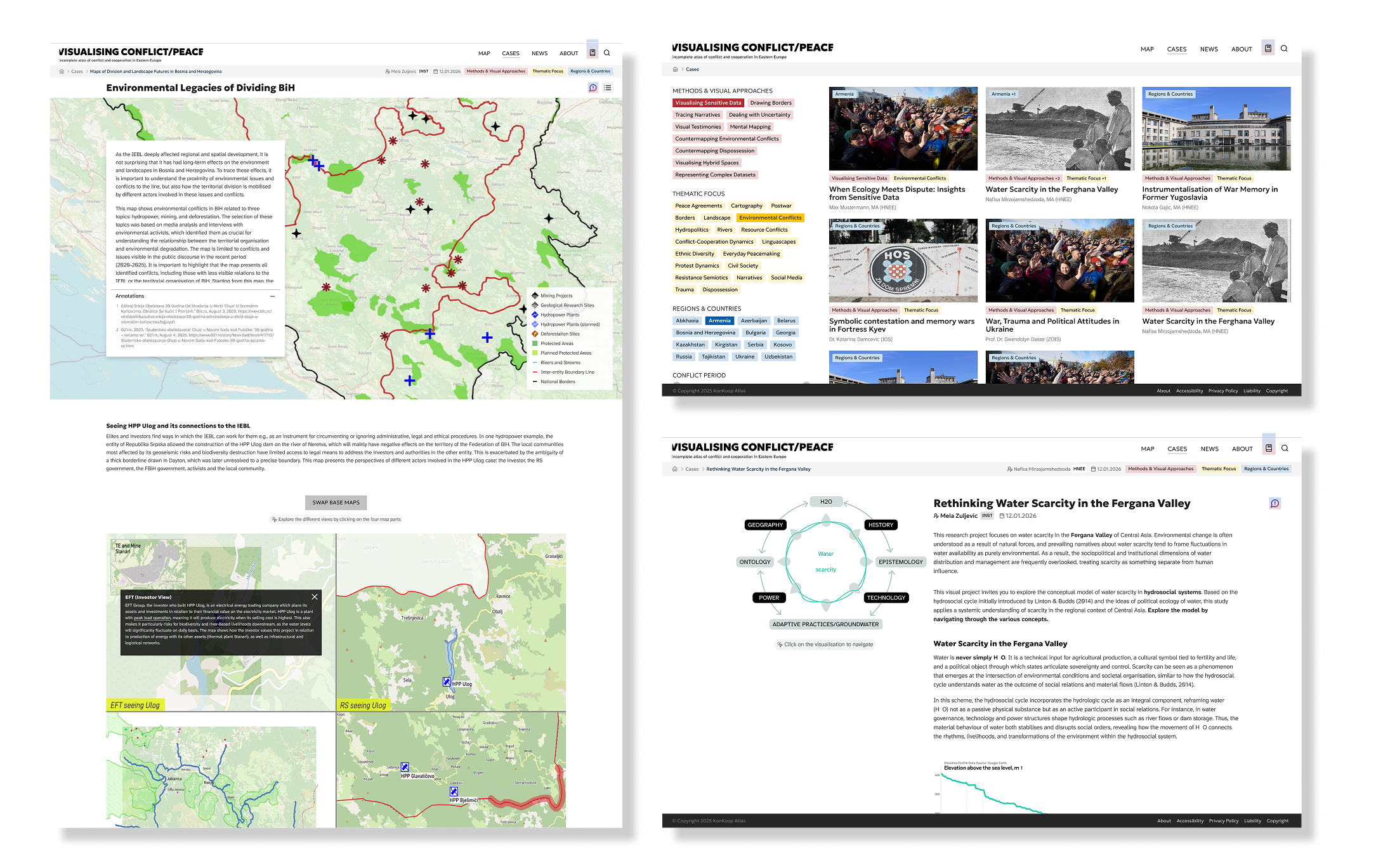
At launch, the Atlas contains nine case studies. More will be added. To facilitate navigation through a growing collection, a filtering system was developed that operates based on three independent taxonomies.

Filter Icon

Combinatorial Search

At launch, the Atlas contains nine case studies. More will be added. To help readers navigate the content, a filtering system has been developed that operates on three taxonomies:

  • Methods and visual approaches — counter-mapping, dealing with ambiguity, visual testimonies
  • Thematic Focuses — Borders, Water Politics, Culture of Remembrance
  • Regions and Countries — Western Balkans, South Caucasus, Central Asia

By combining all three, users can conduct highly targeted searches—for example, for all case studies on counter-mapping and borders in the South Caucasus.

Entwicklung und Integration

Technical Basis

Implemented based on:

  • Search API for the search infrastructure
  • Facets for the filter UI
  • Views Ajax History for functional browser navigation

Faceted Search shows in real time how many cases exist for a given combination—a crucial UX aspect for exploratory research.

Redaktionelle Autonomie und Barrierefreiheit

Das VisLab-Team soll neue Cases, Taxonomiebegriffe, Autor:innen und Visualisierungen eigenständig pflegen können. Dauernde Abhängigkeit von Entwickler:innen war keine Option. Das gesamte System ist darauf ausgelegt.

Barrierefreiheit

Barrierefreiheit im Redaktionsprozess

Editoria11y läuft direkt im Drupal-Backend und weist Redakteur:innen schon beim Erstellen auf Unzulänglichkeiten hin:

  • Automatische Prüfung von Kontrasten und Alt-Texten
  • Kontrolle der Überschriftenhierarchien
  • Validierung semantischer HTML-Strukturen
  • Verbesserungsvorschläge vor der Veröffentlichung
Technische Details

Datenschutz und Mehrsprachigkeit

Matomo sorgt für datenschutzkonforme Nutzungsanalyse — alle Daten bleiben auf der Infrastruktur des Instituts. Das COOKiES-Modul stellt DSGVO-konformes Cookie-Management bereit.

Für die internationale Ausrichtung sorgen TMGMT und die TMGMT-DeepL-Integration, die maschinelle Übersetzungen direkt in den redaktionellen Workflow einbinden.

Was den Atlas besonders macht

Modell für digitales Publizieren in den Geistes- und Sozialwissenschaften

Visualising Conflict/Peace sitzt zwischen akademischer Forschung, kritischer Kartografie und digitalem Publizieren. Das ist eine ungewöhnliche Kombination. Er funktioniert als Infrastruktur, die mit dem Netzwerk wächst. Eine abgeschlossene Forschungswebsite ist er nicht.
Der reflexive Anspruch hatte direkte Konsequenzen für die Gestaltung. Wie viele Informationsebenen verträgt eine Oberfläche, bevor sie überwältigt? Diese Frage zog sich durch alle UX-Entscheidungen.

Custom Module Icon

Technische Grundlage

Aufbauend auf über 110 Contrib-Modulen und mehreren Frontend-Bibliotheken erreicht die Plattform ein Maß an redaktioneller Flexibilität und visueller Differenziertheit, das Standards setzt

  • Leaflet, Mapbox GL JS für Kartografie
  • Scrollama, GSAP für Scrollytelling
  • Search API, Facets für Navigation
  • 6 eigenentwickelte Custom Modules für projektspezifische Features
Barrierefreiheit bringt bessere Performance

Live-Umfang zum Launch

Zum Launch umfasste die Plattform neun veröffentlichte Cases aus Regionen wie:

  • Ukraine, Bosnien-Herzegowina, Georgien
  • Abchasien, Transnistrien
  • Serbien, Kroatien, Fergana-Tal

Kontinuierlich erweiterbar durch das Redaktionsteam — ohne Entwicklereingriff.

Unsere Lösung

KonKoop Atlas Website Home Map
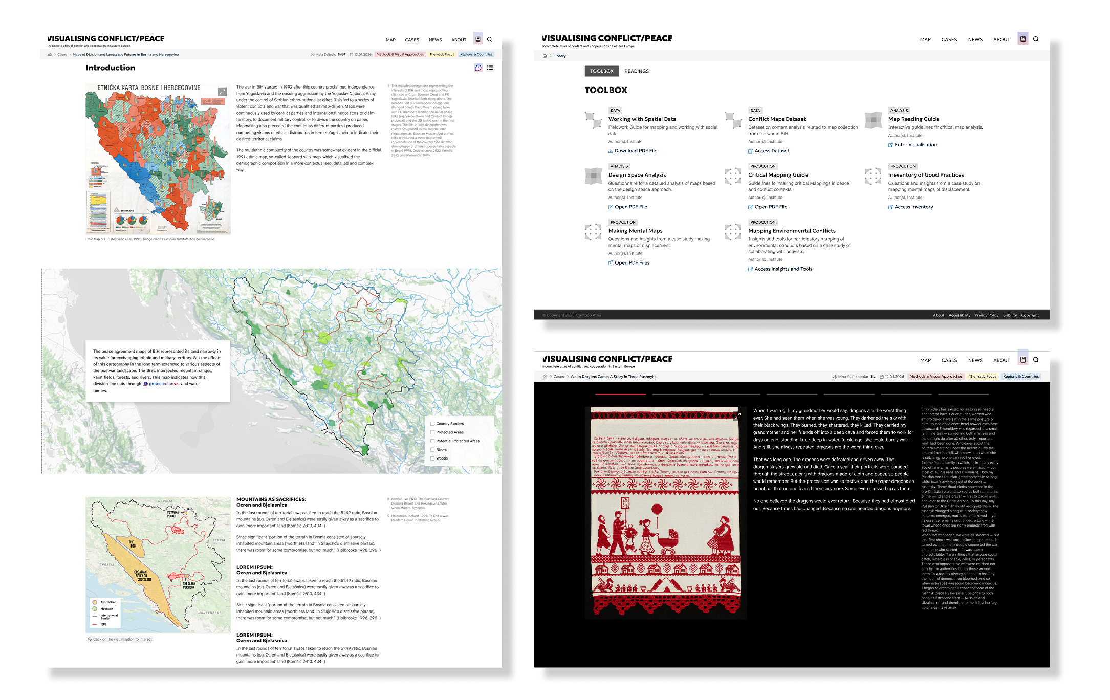
KonKoop Atlas Website Screenshots

Unsere Leistungen

Design
Design System
Drupal development
Quality assurance
Technical architecture
User Experience

Eingesetzte Technologien

Drupal
PROGRESSIVE Drupal

Are you interested?

Do you have something digital in mind? Let's talk about it.

Oder einen Termin vereinbaren?